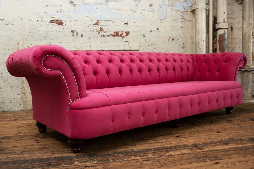
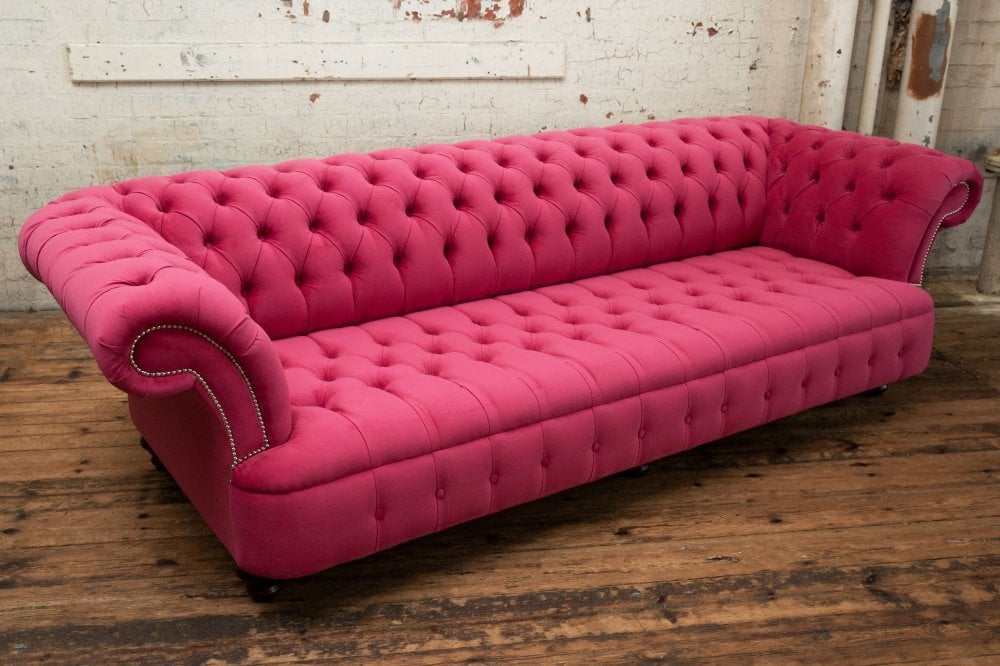
Choose a pink Chesterfield sofa for warmth with real sophistication. Handcrafted in our Manchester workshop with deep button tufting, available in blush, dusty pink or rose, in leather...
Pink has quietly become one of the most sophisticated colours in modern interiors, though it rarely gets the credit it deserves. The soft plaster shades appearing in boutique hotels and restored townhouses all belong to the same family, bringing warmth where white can feel stark and character where beige fades into the background.
Everything changes when those shades are wrapped around a Chesterfield, because the deep hand pulled buttoning, generous rolled arms and timeless silhouette give pink a quiet confidence that lighter contemporary sofas rarely achieve. Suddenly the colour feels less playful and far more collected, as though it has always belonged in the room.
That balance is exactly what makes pink so appealing in this shape. Choosing a muted blush gives you something that behaves almost like a warm neutral beside oak, linen and aged brass, while moving toward rose takes the room somewhere richer without ever feeling overdone.
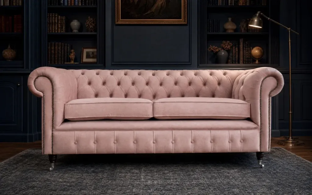
Our House Dusty Pink velvet is where most people start, muted enough to work as a warm neutral in almost any room
Cloth is the natural place to look first, since the pink fabric choice runs considerably wider than the leather
Muted pinks behave like warm neutrals, sitting closer to terracotta than to anything you would call bright
Every piece is handcrafted to order in ourManchester workshop, with free delivery across mainland Britain in six to eight weeks
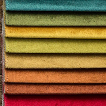
Pinks shift noticeably depending on what sits beside them, soorder up to six free swatches and hold them against your own walls before deciding.
02
Why Pink Works on This Shape
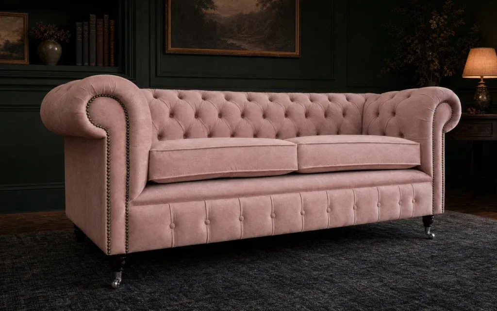
Some colours become more interesting the closer you get to them, and pink is one of them. Every button, pleat and fold catches the light differently, letting the colour drift from soft plaster tones to richer rose shadows through the day. It is a detail people rarely notice consciously, though they almost always feel the effect.
The buttoning stops it looking flat, since pink deepens noticeably into every fold and lifts again across the seat
The heritage silhouette carries the colour, so the result reads as considered rather than as a decorating experiment
It warms a room instantly, which is why designers reach for plaster and blush tones in spaces that feel cold or overly grey
It flatters skin and lamplight, making it an unusually kind colour for a room used mostly in the evening
03
Choosing Your Pink Chesterfield Sofa
The difference between a powder pink and a deeper rose is the difference between a quiet room and a memorable one, so it is worth deciding which you actually want.
DUSTY AND NEUTRAL
House Dusty Pink is the shade to start with, muted enough to function as a warm neutral alongside oatmeal, cream and natural timber. It appears across several designs and is the most requested pink we make.
SOFT AND POWDERY
Matt Blush and Powder Pink are gentler again, with a chalky quality that suits bedrooms, reading corners and any room you want to feel calm rather than lively.
WARM AND DUSKY
Rose and Fondant in our Aqua Clean velvets lean slightly deeper and warmer, which makes them the most forgiving pinks in the collection and the easiest to pair with brass and walnut.
QUIET AND WOVEN
Petal plain wool is the understated choice, bringing the warmth of pink with a soft matt surface and none of the sheen velvet brings to a room.
Full descriptions of every hide and cloth sit on ourleather andfabric pages.
04
Pink Beyond Leather
Pink is one of the few colours where cloth is genuinely the better answer, since the fabric range runs much wider.
Velvet in House Dusty Pink, Matt Blush and Powder Pink, where the pile gives the colour a depth flat fabric never quite reaches
Aqua Clean velvets in Rose, Fondant and Blush, which repel liquid so most everyday spills lift with nothing more than water
Ballerina vintage velvet, for something a little more faded and old fashioned in the best possible sense
Petal plain wool, soft and matt and the most understated way to bring pink into a room
Cherokee Blush leather, for anybody who wants a pink sofa with a wipe clean surface and a firmer hand
05
What to Pair It With
Pink is considerably easier to decorate around than people expect, largely because it behaves like a warm neutral once the shade is muted enough.
Walls that work. Warm white and chalk are the simplest backdrop and the one that lets a blush sofa look effortless. Deepgreen and forest make the pairing that surprises everybody and looks extraordinary, while softgrey and greige give a tonal, gently faded room with plenty of texture.
Textures that flatter. Walnut, oak and rattan keep pink grounded, and aged brass suits it far better than chrome. Olive, terracotta and burnt orange cushions all sit surprisingly happily against a pink sofa.
A green Chesterfield armchair beside a blush sofa is one of the more reliable combinations in modern interiors, and abrown leather piece does much the same job with a little more warmth.
06
Choosing the Right Chesterfield
A 2 seater in dusty pink velvet is the easiest way in, since a smaller piece keeps even a bold pink under control
A3 seater or4 seater in a muted powder or rose anchors a room while still behaving like a neutral
TheGeneva is the design we most often recommend in pink velvet, since its curves give the colour somewhere to move across. TheConrad spans nine sizes and remains the most adaptable, while theEdward andEdwardian carry the period detailing that keeps a soft colour feeling grown up. Every one is built by experienced makers in Manchester using time honoured techniques, and the frame beneath carries ourten year guarantee.
07
Frequently Asked Questions
What colours go with a pink Chesterfield sofa?
Walnut, oak and aged brass keep it grounded, while oatmeal and cream textiles let it sit quietly. Olive, terracotta and burnt orange all work surprisingly well as accent colours against pink.
Is dusty pink a good colour for a Chesterfield sofa?
It is the best pink for most rooms, and our House Dusty Pink velvet is the shade we are asked for most. Muted enough to behave as a warm neutral, it sits closer to terracotta than to anything bright.
Can a pink Chesterfield sofa look sophisticated rather than overly feminine?
Yes and the shape is what makes it, since the weight of a Chesterfield and its deep buttoning give the colour a seriousness a softer silhouette would lose. The muted shades read as plaster rather than as anything remotely girlish.
What colour walls go with a pink Chesterfield sofa?
Warm white is the safest and most flattering choice for any shade. Deep green is the unexpected pairing that consistently looks best, while soft grey and greige make a gently faded tonal room.
Does a pink Chesterfield sofa work in a modern interior?
Very well, because a minimal room often lacks warmth and pink supplies it without adding visual weight. Keep the surrounding furniture simple and let the buttoning carry the texture.
Is pink velvet a good choice for a Chesterfield sofa?
It is the choice we would recommend, since the pile gives pink a depth and warmth that flat fabric cannot reach. The Aqua Clean velvets are the practical option for households with children or pets.